

Need some advice?
Need help selecting a colour for a specific scheme or setting? Get in touch.
Contact us
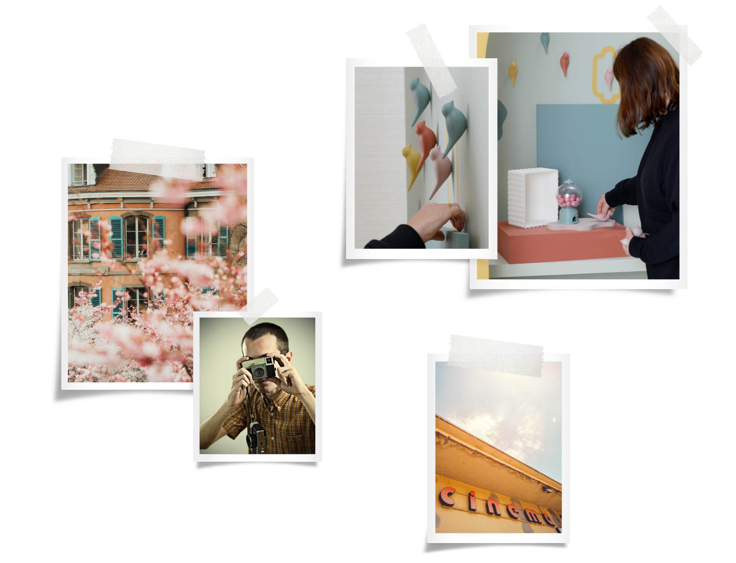
Let your senses take a nostalgic trip and escape from reality into a sugar-coated dream land. Dive into the memories of hazy summer days at your ultimate holiday destination or into a make-believe land of your favourite feel-good movie.
Escape’s mustard is reminiscent of the 70s, combined with the more recent terracotta tones, it creates a dream palette. Creating escapism in the everyday is a great way to ensure joyful spaces, complemented with the retro and European influences of this palette. The use of pink in this scheme brings positivity and an element of youthful wonder.
Need help selecting a colour for a specific scheme or setting? Get in touch.
Contact us