


Published January 2021
Colour and Dementia
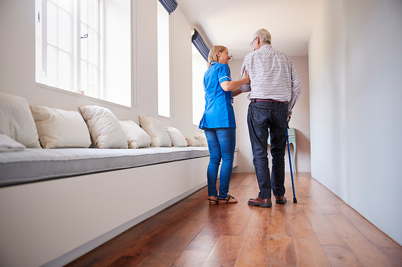
Attentive care is the primary concern when it comes to looking after people with dementia, but colour and design also plays an important role.

Published January 2021
Attentive care is the primary concern when it comes to looking after people with dementia, but colour and design also plays an important role.
Colour can be used to create homely, welcoming spaces to promote independent living and create safe spaces for people living with sight loss and dementia.
Flooring, furniture, soft furnishings and the wall colour all contribute to the overall colour scheme and a happier result will be achieved if all of these elements harmonise with one another to create an aesthetically pleasing look.
It is worth bearing in mind that due to natural thickening of the lens with age, older people may experience colours as ‘washed out’ and may increasingly find blues, greens and purples harder to differentiate and these colours may appear as shades of grey. The warmer colours of reds, oranges and yellows are much more easily identifiable.
Tonal contrast between critical surfaces is really important to help a person understand and navigate their way around a space. Tonal contrast is a measure of how light or how dark a colour is. In a built environment the guidance for contrast between surfaces is 30 points (20 if there’s a good amount of lighting). The tonal value of a colour, otherwise known as the Light Reflectance Value (LRV) is identified by the two middle digits of our scan code.
· The wall colour and the door colour.
· The wall colour and the floor
· Handrails and the wall colour
· Chairs and chair arms and the floor
· Kitchen work surfaces and the floor
· Kitchen worksurfaces and units
· Toilet seats and the toilet
· Step edges to stair treads and risers
If feature walls are used to highlight a change of direction, it is best practice to ensure they contrast at least 20 points with the main wall colour.
Worktops which are of a solid colour rather than patterned and which have a matt finish to them are easier for people to work at, since matt finishes result in less glare
It can be easier for people to locate and use switches and sockets, handrails and handles if they contrast tonally to the wall behind them.
In care homes, draw attention to bathroom doors whilst camouflaging others such as store cupboards, which are off limits.
Careful consideration into a the design of a building is key for helping people with dementia…
A porch or canopy into the building can help a person’s eyes adjust to the change between outdoor and indoor lighting levels. A reception area should be bright and welcoming with comfortable seating and lighting that guides the eye towards the most important elements, such as signs and way markers. Ideally, photographs should be placed on the walls depicting local landmarks to aid recognition and thus provide a sense of security.
It is important to use tonal contrast between critical areas and pay close attention to lighting. Ideally, floors should be carpeted to minimise injury from any falls. However, floorcoverings should be consistent in tone from the corridor to any rooms accessed by people with dementia, with no obvious visible barrier at the threshold which could be perceived as a physical hazard. Where different flooring materials meet, use textures and colours similar in appearance to encourage movement across the join. If possible try to avoid threshold strips which can cause people to stop or falter, as these too appear to be an obstacle.
Avoid patterned, striped or flecked carpet as this can cause confusion and although it is recommended that items such as doormats should be similar or identical in tone to the carpet it is better to avoid them altogether. As dementia progresses it can cause people to lose mobility and shuffle their feet when they walk; this combined with reduced vision can cause them to trip and fall over any uneven surface. Again choose matt, non-slip finishes and steer clear of any type of flooring with a sheen as this takes on the appearance of being wet and therefore slippery. In some instances contrasting textures and colours could be used to act as a deterrent.
Textures and patterns can be stimulating in an interior but they can also be overwhelming. Familiar patterns are reassuring but in unfamiliar surroundings some designs can cause confusion with those living with Dementia. Strong geometric patterns in contrasting colours distort the space and in some cases cause hallucinations and therefore should be avoided. Patterns with flecks or small motifs can cause problems as they can misinterpret them as bits of fluff.
Wall prints and designs can add a point of reference for wayfinding but realistic murals of a pathway leading to a forest for example, may cause confusion as people may think the print is real and walk into it.
Textures such as velvet, wool, linen and cotton are seen as ‘dry’ and therefore warming. Rich textures and self-coloured prints are effective in adding interest to a room without causing discomfort and will help to create a homely space.
Signs & visual aids can usefully be adopted to help people remain independent for as long as possible. The use of pictures as well as words will help to illustrate a room’s function. For example, the use of a clear, graphic illustration of a bed would depict a bedroom and is best attached to the door of the room rather than an adjacent wall. It is thought that using graphics as well as words assist understanding. Here, black or dark grey text on a yellow background is the easiest to see. The University of Stirling suggests that signs should be mounted at a height of 1.2m above floor level because people living with dementia tend to look predominantly downwards.
More information on colour and dementia is covered in our Interior Colour Book
In every living area, workspace or commercial hub, colour is something you can’t do without. Get expert advice on utilising colour to its full potential to create the perfect environment.
